HUMAN COMPUTER

Software Design & Product Management

The Thorough User Story

If you’re a product manager working on a software project, you probably spend a large chunk of your time communicating new requirements to designers and engineers. The temptation for many PMs is to throw one or two “user story” statements into a ticket (for example “As a lawyer I want to find legal documents by case number so that I can do my job faster”), ask the designer to attach a mockup to the ticket, and throw the ticket over the fence into Engineering Land. Any more detail than that and you risk writing a “specification” — something frowned upon in the world of Agile development.

While such a minimal approach to documentation can save time upfront, it ultimately leaves the door open for a variety of risks that can delay a project, waste work, and cause frustration. Skimping on upfront design and documentation places the success of the project on a host of assumptions: that everyone attends design meetings and takes notes. That you’ll be there to answer questions when a feature is built. That the engineer you originally discussed a feature with is the one that ends up building it. That everyone asks questions. That the engineers are in tune enough with the roadmap to architect features in a forward-thinking way. That the testing team was taking notes when you discussed edge cases with an engineer. The list goes on. And these things add up — the larger the team the more severe the consequences of under-communication. As a PM you can mitigate such risks by including a few details in your user stories and tickets:


BUSINESS CONTEXT

WHAT: Clearly describe the business need and context before you get into your requirements / acceptance criteria / design. User story statements are a big part of this but don’t forget to mention context around clients, urgency, and competitors.

WHY: Let’s say you’re trying to match a competitor’s search capabilities and you come up with an idea for a fancy search box. You document the solution in a ticket and slide it over to the designer for a UI mockup. If you don’t mention your competitor in the ticket, the designer is unlikely to propose other (potentially better) solutions or to study that competitor’s UI. Likewise, let’s say that your search box was requested by a specific customer. If you don’t record this information, the QA team will not know to test with the proper customer-specific sample data or testing environment.

PRODUCT & PROJECT CONTEXT

WHAT: Before getting into requirements, add some background into how users solve the problem today, what — if any — foundational elements have already been built, and how this work fits into the whole. In your mockups, use color coding or annotations to clarify which parts of a screen are specific to this ticket. If you’re enhancing an existing feature, remind the team what other parts of the product this feature affects and where else it appears. If this is a larger story, mention the ticket breakdown and add some links.

WHY: As a PM it’s easy to forget that most of your team is focusing on implementation details and specific feature areas. No one knows the whole product on holistic functional level as well as you do. Small reminders like this help avoid many ugly situations, from “Oh I didn’t know that part was built yet … so I built it again”, to “I didn’t know that UI element was shared across several screens so I only designed/tested on this screen”, “I didn’t know that feature also did X”, and “I didn’t know this was a temporary stop-gap solution so I spent a long time optimizing it”.

PM OWNER

WHAT: Record a single clear PM owner for each ticket. Depending on your ticket management system this may be as simple as looking at who created the ticket. The clearest way is to simply list it at the top of the user story.

WHY: Team members often don’t know where to go for clarifications. Even if you’ve recorded the work required in excruciating detail, the development team will likely have additional questions. And if you have more than one PM on the same product this can get confusing. The best case scenario is that another PM gets distracted and engineers waste time tracking down answers. The worst case scenario is that another PM attempts to be useful and gives engineers the wrong answer. I’ve seen this happen — with an end result of wasted work. This isn’t limited to development either. After a feature is built, the QA and support team will have questions about intended behavior that may not be clear from your user story or documentation.

SUMMARY / ACCEPTANCE CRITERIA

WHAT: In a few bullet points, address what changes will be made to the software on the frontend and backend. This is more solution-specific than user story statements but short enough to be quickly skimmed.

WHY: A bulletpoint summary of feature work has many uses. It helps engineers provide a rough estimate without needing to delve into details. It helps the team properly assign work to subject matter experts. It inspires questions while still early enough for a design to be changed. It makes it easier for executives and managers to get visibility into what’s coming up without relying on ticket titles. And it makes it easier for engineers to navigate details and mockups down the line. And, finally, it helps engineers and the QA team confirm that nothing significant has been left out before going through a full testing cycle.

NON-GOALS & FUTURE FEATURES

WHAT: List what problems you don’t want to solve as part of this ticket, what solutions are off the table, and what related work is coming up in the future.

WHY: This is an often overlooked detail that can have a big impact. To go back to our earlier example: if you’re building a search box it’s worth mentioning that you don’t care about auto-suggest. This not only helps designers scope their proposals and avoid wasting work but it also helps engineers provide better estimates. Finally, if any of your non-goals are things that WILL come up in the future, mention this (and potentially link to appropriate tickets in the roadmap). Remember — as PM you are an expert on the product roadmap. Knowing what’s coming up will ensure that engineers come up with a forward-looking architecture and spend less time down the road uprooting and rewriting code.

OPTIONAL ENHANCEMENTS

WHAT: Make it clear which parts of the story are optional nice-to-haves. These are typically little embellishments and polish ideas that you can live without — especially if you’re short on time. They’re not non-goals but they’re also not requirements. It’s also worth “time boxing” these — for example by specifying that they should only be tackled if they’re likely to take less than 45 minutes.

WHY: Simply put, this is a way to maximize small touches and other optional details that delight users while reducing the risk of delaying other critical work or cluttering up your backlog. If a designer suggests a fancy tooltip but you’re unsure whether it would add significant development effort, mark it as optional. It may end up being something that can be built in 15 minutes, in which case it was worth bringing up and building out. However, if it ends up being a significant undertaking you don’t want to find out that other work was delayed because your team interpreted it as a hard requirement and spent time building it.

DESIGN DETAILS

WHAT: The devil is in the details. Even the smallest features have a number of tiny details that end up being overlooked because no one bothered to spell them out. This translates into incorrect estimates, bad user experiences, and disruptions down the line. As you work closely with engineers you’ll develop a better intuition for these. You’ll also want to work with designers (especially those new to interactive design) to ensure that they’re considering these kinds of questions ahead of time:

  • FUNCTIONAL: which fields in a form are required? What is their max and min length? Would you prefer a list to infinitely scroll or paginate? When the user updates something, what other parts of the screen should refresh?
  • ERRORS: what are all of the possible error states and what messages should users be shown?
  • INTERACTIONS: what are the hover behaviors over links and buttons? Which elements should scroll with the page and which ones should stay in a fixed position? When the page is resizing, does the side pane stay the same pixel width or does it resize proportionally?
  • EDGE CASES: what happens if a user tries to deactivate an account that’s been deleted? What happens if you try to reimburse money to an expired credit card?

WHY: Omitting details makes for a sloppy product and an unhappy team down the line. While conscientious developers will fill in some of the blanks, you risk frustrating your users, shipping unprofessional copy and UIs, overwhelming the support and QA teams, and interrupting the dev team with frequent small fixes.


This is not an exhaustive list. Neither are any of these details universally useful. Small experienced teams may not benefit from all of these. Some of the details may be overkill for tiny features. At the end of the day it’s up to you and your team to decide which of the information above is worth documenting. The answer may change over time and as your team grows. Try out different documentation approaches — especially if you find yourself hitting any of the pitfalls above — and see if they benefit your team.

How to File Bugs Like a Pro

Software development is typically a bumpy ride for everyone involved. Even if your user stories are airtight, as a Product Manager you’ll always end up running into at least a few kinks that need ironing out before your app sees the light of day. That’s why proper testing and dog-fooding is critical to the success of a product — as integral as good design and engineering. Who’s to disagree? Many teams, however, don’t give much thought to the quality of the bugs they file. I’ve seen PMs (and even testers) file bugs as terse as “button doesn’t work”, expecting a fix to materialize. Scale this out over a few hundred bugs and you end up with a communication bottleneck that has a real impact on project velocity and product quality.

This article outlines some of the most useful (and commonly omitted) details to record when filing a bug, along with extra tips and tricks to help engineers debug faster — from using CloudApp to record videos to copying javascript errors from the browser console.


(Clear Your Cache): Don’t be that person. Before you even begin testing your web app or product, clear your browser’s cache so that you’re actually loading fresh code. I can’t tell you how many times I’ve seen PMs spend time filing bugs a la “new feature is not there — link is missing” just because their browser was reusing outdated code. If you don’t want to clear your cache each time, just test using a new Private Browsing Mode or Incognito window.

User Account: Were you logged into an account? If so, which account were you using? Does the same thing occur when you use another account? Make sure the dev team is able to easily access these accounts. Rather than sharing credentials within a ticket It’s useful to set up a few test accounts that everyone has access to.

Environment / Version: You likely have multiple versions of your product running. Did you hit the problem in the live production environment, the staging environment, or a dev environment? Were you connected to a particular test server running a particular branch or release version? If you’re able to reproduce the problem in other environments too, it’s worth mentioning as it will help the dev team track down a common cause. Note that some project management ticketing systems like JIRA have a specific field to track this — it’s called “Affects Version”.

Browser / OS: What Operating System were you using and what version of what browser? Have you tried it in different browsers or OSs and did the same problem occur there? Browser discrepancies are not quite as rampant as they used to be but you’ll still run into problem here and there — especially when it comes to visual details.

Expected & Actual Behavior: This seems like common sense but it’s still glossed over frequently. List the exact steps you followed to make the bug occur. Finally, mention what you EXPECTED to happen versus what actually happened. Remember, what may be obvious to you is not obvious to others. Link out to the original user story or feature ticket that described the desired behavior, especially if the expected functionality requires more context and detail. If turns out that no expected behavior was ever defined, what would you like to see happen? In the latter case you should consider filing this as an improvement rather than a bug for the sake of tracking clean metrics and velocity — and ensuring that you’re not accidentally placing implicit blame on a developer.

Screenshots and Videos: A picture is worth a thousand words when filing bugs. Learn the keyboard shortcut for capturing screenshots and attach them to your ticket. Better yet, use CloudApp to record animated gifs and videos of your interactions and even annotate them.

Code Errors: This is rarely done by PMs but it can save a great deal of time for everyone. It can also hint at bugs that share a cause, keeping you and others from having to file and read multiple bug reports that are actually different manifestations of the same under-the-hood problem. There are several kinds of errors worth recording

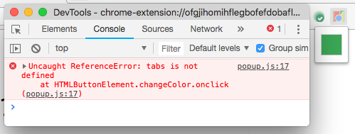
  • In the Javascript Console: If your app, website, or product runs in a browser, open up the browser’s Developer Tools while testing. These are usually accessible via a simple menu click or keyboard shortcut. If this is your first time seeing the Developer Tools, don’t be intimidated. This is just the place where your browser reports issues it runs into while running javascript or downloading / uploading information. Make sure you’re on the Console section/tab of Developer Tools. When you run into issues with the app, check to see if any messages popped up in the Console and copy them into your bug ticket. See if you can identify exactly which interaction makes these messages pop up by refreshing the page and replaying the same set of interactions. One more thing to keep in mind: the app may not run well after one of these javascript code errors. So if you run into a number of bugs after an error like this, it might be the case that they all share the same cause and may not warrant separate bug tickets.
  • In Network Activity: Your Developer Tools window will also have a “Network” section. Here you’ll be able to see the communication between your app (in the browser) and your app’s server or other third party APIs — requests, responses, and all. If something isn’t working quite right — for example the Checkout button doesn’t work, or a user profile isn’t fully loading — you’ll be able to see the exact requests triggered by your interactions, including their details and any communication errors. You’ll see everything from server errors (ex: “500” or “404”), to third party errors (ex: Facebook authentication isn’t responding), to obvious bad requests (ex: no item ID specified when adding to cart). Copy these into your bug tickets. Not only will the engineering team thank you for making their job easier, but you’ll save time in bug triage / assignment and you’ll develop your own intuition for how to work around an issue.
  • In Logs: There are likely other places where your technical team is recording errors, whether from the server itself, code running on the server, or third party monitoring tools. Find out how to access these and copy down any errors you see here into your bug tickets.

Related Issues: Do you suspect that your bug might be caused by another bug? Or that it might be a different facet of an already-existing bug? Note this down to help your team investigate more quickly and carry out their work in an optimal order. Sofware like JIRA allows you to link tickets to others, marking them as “duplicate”, “causes”, “caused by”, and so on. Use that to your advantage. Oh and one more thing: if everyone on your team is filing bugs, you’re prone to end up with quite a few duplicates and wasted work. The simple solution: designate one or two people as the gatekeepers for all new bugs.

Where Should the Fix Go? Some bugs are minor enough that they don’t need to be patched instantly in a live production environment. Other fixes are so serious that they need to be deployed right away, even if it means disrupting a live server. Others are specific only to certain versions of the software — for example a version sold to a particular customer. Make it clear which builds and versions of your product this issue should be fixed in. Software like JIRA has a specific field to capture this tidbit — it’s called Fix Version.

Priority & Classification: How bad is this? Is it a critical showstopper or a smaller cosmetic issue that only affects a few users? This is one of the most important things you’ll communicate to the dev team. Make sure that you’ve agreed upon a clear hierarchy and workflow with your team ahead of time. Any project management tool will have a “Priority” field built in so you might as well use it. But you may also be putting the most important work at the top of the backlog or current sprint board. So be clear with your team about how the Priority field on a bug (or any ticket) relates to force ranking in the backlog to avoid misunderstandings or delays. Finally, if your ticketing system supports it, make sure to apply useful tags and labels like “UI”, “backend”, “small” etc to bugs. This can help get a bug assigned to the right developer sooner.

Is Product Management Consulting Right For You?

So, you’re a software Product Manager exploring new opportunities. Congratulations — you’re in high demand!

Most of that demand comes from product companies — businesses that ultimately make their money by building and selling a product. But you may also see job ads for consulting shops (or agencies) that need Product Managers to build software and solutions for various clients. If Product Management consulting (or even design or engineering consulting) is something you’re interested in pursuing, this article is for you.

While many aspects of your day-to-day job will be the same in both industries, consulting at an agency (or even freelance) presents some unique opportunities and challenges that are worth considering before you make the plunge.


Let’s start with a list of what makes consulting great.

Exposure to many industries: Everyone needs software. As a consultant you may start the year building an IoT solution, move on to digital publishing, and cap off the year working in real estate. If you’re entrepreneurial or even just curious, this constant exposure to new niches, business opportunities, and in-demand problems can be hugely valuable.

Experimentation: While consulting projects can span years, you’re likely to take on many projects that last much less than that. Every few months, you’ll get a chance — or you’ll be forced to — step out of your comfort zone. This means getting experience with different team structures, project management tools, QA and analytics approaches, design workflows, etc. The list goes on. Unless you’re working at an extremely fast paced product startup or switching teams within a larger product company frequently, you’re unlikely to get the opportunity to experiment and learn at this rate.

Soft skills: At a product company it’s relatively easy to spend most of your time interacting only with coworkers. At a consultancy you’re interacting directly with clients on a daily basis. Not only that but your company is ultimately selling a service — not a product. Even if your software is brilliant, a lack of professionalism, polish, and patience will spell doom for your career. Of course great interpersonal skills are an asset at any company but, in consulting, they are a strong requirement. This is ultimately to your advantage — expect to come out of consulting with better soft skills.

Owning entire products: Many larger product companies and startups assign a product manager to a specific subset of features rather than an entire product — at least for starters. As a PM consulting for an agency or freelance, you’ll typically own an entire product. If you’re just starting out in your career this is a great way to take on more responsibility and learn to think holistically about products and business.

Project flexibility: If you’re really not meshing with a team or project, a consulting agency affords you the opportunity to switch to a different project without quitting your job. This is also possible at larger product companies with many departments, but on a smaller scale. At the end of the day, a product company has likely hired you with a specific team or product in mind.

Networking opportunities: Over time you’ll develop close relationships with your clients and their staff. Down the line these relationships can turn into full time job offers or networking opportunities. You can view a consulting project as a “try before you buy” deal for both you and the client.


That all sounds great — right? Before you sign that job offer, let’s talk about some of the challenges of consulting.

You’re a mercenary: If you find it difficult to work on projects that don’t interest you, consulting may not be a good fit. When you sign up to work for a consultancy, you should expect to work on at least a few projects that you simply don’t care about. You might find yourself doing IT support. Or working on delivery logistics UIs for a tractor manufacturer. Having said that, keep in mind that this can happen at any company — it’s just more pronounced here. Before accepting an offer, ask yourself how easily you can stay motivated. It’s also worth asking how often the company kicks off new projects, what some of the ‘less sexy’ projects are, and how much say you will have in project assignments.

Limited control over product vision: This one applies more directly to PMs than to engineers or to designers. At a product company you decide what gets built. This requires some mix of creative brainstorming, competitive analysis, market research, and user feedback. At an agency the client decides what gets built. While the ideal client will come to you with a rough problem and ask you to come up with the solution, many if not most clients already have a rough idea of what features they want. Expect to spend more time on UX design and execution (aka: project management) of someone else’s vision.

Happy Client > Good Software: The primary goal in consulting is a happy client’s continued business — not great software. Keeping a client happy can mean prioritizing politeness and deference over best practices. At a product company mandates typically come from people with some basic understanding of the software development process. In consulting, regardless of your role, you might find yourself spending non-trivial amounts of time persuading clients against their own not-so-great ideas. And sometimes you’ll fail. As an engineer you may have to sacrifice tests because the client just doesn’t understand their value. As a designer you’ll have to mock up something with glaring edge cases. And as a PM you may need to regularly deliver these disappointing mandates to your team. Note that it’s not just clients whose decisions you have to live with. Your agency’s upstream sales team may promise an unrealistic or subpar solution to win a client — and you’ll be in charge of executing on it. To avoid situations like this, find out how an agency’s project pipeline works and how client relationships are handled. And be prepared to deal with frustration.

Relationships with client staff: This one is relatively minor but still worth mentioning as it can be a real source of frustration. Companies hire agencies to build things either because they don’t have an internal team for the job or because that team is overbooked or unable to deliver. The latter is where things get uncomfortable. Your arrival may be a threat to the client’s workforce — whether IT, design, or engineering. It may imply a vote of no confidence and, even worse, a sign that they may soon be permanently replaced. This is rare. Still, you should be prepared for occasional foot-dragging, finger-pointing, and delicate politics. Above all, you should be able to remain polite and cool-headed all the while. Unlike in a product company, you’re not up against a difficult coworker. You’re up against your client.

Limited long term ownership: If software projects were meals, many consulting projects would equate to tapas. You build a MVP. Then you hand it over when it launches. Then you move on to the next project. While this can make you an expert at kicking off projects, you miss out on important skills and challenges inherent in the latter part of the software cycle. You don’t learn to pivot when faced with bad market fit. You don’t learn to analyze metrics and tweak designs based on user behavior. You aren’t forced to refactor the codebase to accommodate years worth of new code. Of course not all projects are like this; after all it’s more cost effective for an agency to continue working with existing clients than to find new ones. Just be mindful of this risk and pick your projects strategically.

You’ll be on the bench: Depending on the number of clients, the timing of contracts, and the allocation of resources, you may spend some time “on the bench” until you’re assigned to a project. Ideally your manager will have somework for you to do. But there will be periods, sometimes even long ones, that you’ll find yourself idly twiddling your thumbs. Be prepared to feel some level of guilt about your limited productivity and perhaps even some job-security-related paranoia. If your manager is not much help in this department, don’t hesitate to reach out to other teams. Likewise, you can use this time to pursue your own professional development or work on tools and resources that you think would benefit the company.

Career ceiling: In a traditional product company there is a relatively clear career roadmap laid out for you. Your success as a product manager on a feature gets you promoted to be the owner of the larger product. Down the road your success on that product may get you promoted to Lead, Group, or Director of PM — a leader who sets a cohesive strategic direction across several related products. In consulting, this path to management is more rare. Each client represents a separate product, for the most part. Your intimate knowledge of a product’s inner workings and insight into its market landscape just won’t carry over to other products as well. There’s certainly space for growth — just be aware that your leadership ambitions may translate more into people management than strategic management — or that you may be forced to switch into “services strategy” role on the sales side.

Do you have product management experience as a consultant? Share your own take in the comments!

Interface & The Mind: Long Term Memory

In the previous two posts, I talked about how basic psychological processes underlie human interactions with software and delved into some detail on how working memory affects interactions.  In this post, I’ll be talking about long term memory.  To continue with the analogy to computers, if working memory is RAM, long term memory is the hard disk – and a pretty fancy hard disk at that.  While working memory has finite capacity, long term memory (by most accounts) doesn’t seem to have such limits – either that or we haven’t come up with good ways to measure it.   Information from your senses is perceived and attended to by working memory and often, with some rehearsal, ends up in long term memory.  You learn.   On the flip side, everything you perceive is ultimately (consciously or unconsciously) colored by what’s already been stored in long term memory – and often anchored using small unexpected cues.  When meeting a stranger, you might make some assumptions about them because their voice sounds similar to that of someone else you know.  Likewise, when you see a narrow white rectangle with an inner shadow on a screen, you assume it’s meant for typing because repeated prior exposure has led you to that association.

A few factors help people learn.   Among them:

  • Rehearsal
  • Presenting information when it’s immediately relevant and needed
  • Presenting information in a top down manner so that relationships between different concepts are clear
  • Relating the information to things that people already know

You can take advantage of these principles to help people better understand high level concepts in your software, better retain interfaces, and better make sense of what’s placed in front of them.


Minimize the Object-Action Matrix

Consolidating concepts will go a long way toward helping people learn.  English is known to be a notoriously hard language to master because of the number of exceptions in its rules of grammar and syntax.  When you’ve learned the rule for conjugating a certain class of verbs, you’ll be surprised to find out that the rule doesn’t apply to a few words within that class.  The fewer exceptions, the easier to learn.  It’s the same with software.  Imagine making a table like the one below, with the list of ‘concepts’ or ‘entities’ on the left side and the list of things you can do to them across the top.

matrix

The larger this table, or the more sparse the distribution of X’s, the harder your software will be to learn.  The more rules and exceptions users will have to learn, and the more assumptions they’ll mistakenly make about applying prior knowledge to new features.  The denser and more compact the table, the more people can use understanding of prior features to master other features.  This is especially useful in complex applications because, by definition, they require a great many features.  Take a look at the following examples:

matrix_photoshop

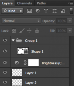
The concept of Layers is one of the cornerstones of Adobe Photoshop, with the Layers Palette (pictured above) taking a prominent place in the interface.  People have, for a very long time, understood what can be done with layers – they can be created, deleted, reordered, toggled, opacity-modified, named, and so on – and how to do each of those things.  Photoshop is a large and complex piece of software, though, with many new features added every release.  So how does Adobe keep from overwhelming their users?  One very clever tactic so far has been to consolidate many new feature concepts with the concept of a layer.  Many features, from Groups to Effects to Shapes to Channels and more, simply take the form of layers and – therefore – receive the same familiar capabilities and access points.   No introduction is needed.  Without prior exposure to an Adjustment Layer (an effect), you already know how to turn it off, toggle it, delete it, change its strength, and so on.


matrix_facebook

Now for something more familiar.  Above is the Facebook Albums interface.   Notice that one of the built-in albums is called “Profile Pictures.”  Back in the early days of Facebook, you uploaded and managed your profile pictures in the Accounts section of the site.  When Albums were added, people slowly became accustomed to using the Albums interface to add, delete, and tag photos, write captions, and so forth.  At that point, Facebook made the wise decision to unify the concept of a profile picture and a regular photo.  Whatever you’ve learned about managing regular photos you can apply to managing profile photos.


matrix_logicOne last example to drive the point home.   Above is the a screenshot of the (very complicated looking) Mixer interface for Apple’s Logic music production system.  Each one the vertical bars represent what’s called a ‘Channel Strip’ – an entity that typically represents an instrument and allows you to create, delete, add effects, send the audio output elsewhere, and change the volume and panning.  Just like Photoshop, Logic is a very complex piece of software and includes not just instruments but audio effects, imported mixes from other software running in parallel, and a “Master Output” that mixes everything down into one ready-to-export song.  That’s potential for a lot of UI exploration and learning.  Fortunately, Eeery single one of these concepts, and more, are handled through Channel Strips.  That way, you can take several instruments, ‘send’ them to one group Channel Strip, which you can then send to an effect Channel Strip, which you pan and silence in the exact same way you’ve done for instruments previously.

You get the point.


Facilitate Rehearsal through internal & external consistency

Much of this post ultimately boils down to ways of facilitating rehearsal without the user having to go out of his way to commit things to memory.  The section above, in some sense, dealt with consistency in expected features.  This section deals with defining standards for look and feel – both internally (within one piece of software) and externally.  The latter is especially important.  No interface exists in a vacuum.  Your users may be accustomed to the way that Microsoft Word organizes its menus and will therefore make assumptions about where to find it in your software.

consistency_twitter

consistency_googleapps

The first image here shows the Twitter front page.  Notice how they make use of the “@” and “#” symbols even in their site’s top navigation menu to help users form stronger associations.   Below it is the top right of every single Google App interface.  No matter which Google tool you’re using, you’ll always see “Comments” and “Share” (as well as your profile settings) at the top right.  No exceptions.   Every time a user sees this, it reinforces their learning and makes them even more confident and comfortable with Twitter and Google products.

consistency_bubble_facebook consistency_bubble_apple consistency_bubble_google

How about external consistency?   Just like spoken and written language, UI conventions and visual vocabularies often have new conventions added.  And just like with language, where a certain sound is associated with a meaning or function, a UI element with a recognizable visual form is assumed to behave like similar looking elements.   To put it simply:  If it looks the same, it ought to act the same.   The concept of a red notification bubble spread from Apple to Facebook to Google.

consistency_at_twitterconsistency_at_facebook consistency_at_hipchat

Likewise, the “@” symbol became a way to single out or target a specific recipient in a message.  This went from (left to right above) Twitter to Facebook to HipChat.

Consistency helps people rehearse things and make use of prior learning.

In the next post, I’ll talk about the value of Just-In-Time-Help and presenting information to users when it’s immediately relevant.


What if Chopin made music software? Three types of user insight in software design

Every business book talks at length about the value of identifying the clubs, subcultures, and other niches you belong to.  It’s the easiest way to identify wide open markets with unsolved problems that are begging for automation, collaboration, and other benefits of well applied technology.  As a software professional, you’re in a unique situation – with insights about niche problems in one hand and technological and business knowledge to solve those problems in the other.  Once you know of the problem, you can throw together an online store to bridge the gap between supply and demand, slap a social network on it – maybe a dating site for that particular community – and be done with it.  In other words, finding a market is the tough part.  Providing a solution is easy.

While this may be the case for online stores or dating software, it doesn’t quite fly for specialized software in technical or creative fields.  Not all software is about automating simple tasks or connecting people.  Some software programs truly innovate.  They change the face of a field, allowing their users to solve novel problems and create unique works.  Sometimes, as with 3D animation, they create brand new fields.  When making such software, finding the market is only half the battle – it’s necessary but not sufficient.  The thing that makes a real difference in this arena is not insight into problems, but insight into solutions.  And this often only comes when the people designing the software are also its users.

I’ve worked with a number of software teams in my career and been witness to three rough levels of user insight that can be present in a product or engineering team.

  1. Little to basic understanding of a problem:  users are not on the product team
  2. Average to expert understanding of a problem:  some users are on the product team
  3. Rare and unique insight into a problem:  users at the top of their field are making the software

This essay focuses on the rare and elusive #3 – a situation where very brilliant and talented people in a field also happen to be involved in the creation of software.  More specifically, the case where (typically) one individual’s rare insight or talent in a field is automated and formalized through software, and is therefore imparted upon others.  By no means is this the only way that disruptive software is created, but it is a notable way in which computers and automation can augment and spread existing human abilities.

Before we go into that, let’s look at #1 and #2 briefly.


Striving for #2

Established tech companies and startups frequently churn out products without having a deep understanding of the problems they’re solving.  Certainly they research market segments, consult with customers at length, develop personas and so forth, but it’s relatively rare that they have a real customer on board acting as a product designer.   Eric Ries’ Lean Startup even warns against the hubris of knowing your customer’s needs without first (potentially failing and) pivoting a few times.  While no one’s going out and bragging about it, most software teams fall into category #1.  There’s nothing to be ashamed about here.  Most people that can design or code software simply didn’t have enough time to become experts in a different field on the side.  And not only does the software generally come out OK, it improves over time as real people make use of it and provide feedback.  After all, this is one of the reasons that UX became such big hit:  if you don’t have insight into the user’s mind, you can send a very empathetic psychology grad over to the users’s workplace to get to know him better.  There are, however, a few advantages to being in bucket #2 and having real subject matter experts at the helm of the software design process:


  • Little decision accumulate:  even if you talk to the customer often, you’re typically addressing the big issues.  Think feature requests and prioritization.  But for every answer you get from the customer, there are hundreds of little design decisions you end up making without consultation.  These are the little on-the-fly layout and workflow decisions you make while sketching an interface.  Often times, you don’t even realize that some decisions had alternatives to begin with.  All of these little design decisions can end up heavily influencing the overall workflow, direction, and utility of your software.
  • Expertise trumps design by committee:  The greater the absence of real data and expertise, the greater the power of personal opinions, agendas, and status will be in influencing design decisions. It’s as simple as that.
  • Quality communication with users:  At any given point in time there is likely a UX or Product Management person sitting with a customer in a conference room nodding his head and smiling without the slightest idea of what the customer is saying.  I’ve seen this in biotech where the customer has more Post-Docs than the UX researcher, and in simpler avenues like web design where the highly paid Product Manager would rather end the meeting early than admit that he’s not up to speed on CSS3.  The problem is even uglier in its more subtle form:  when the lack of insight gets in the way of picking up on implicit issues, hints, and opportunities for deeper questioning.


Wishing for #3

Teams that fit into #1 and #2 make fantastic software:  software that connects people, that automates slow manual processes, that puts information at people’s fingertips.  The whole gamut..or app store.  But every once in a rare while the clouds part and someone with a rare insight or talent in a certain field floats down from heaven (or from his studio or laboratory) to enter the world of software.  This can really shake things up and serves as a recipe for innovation and disruption.


Imagine two different teams creating an app for music composition and production.  One team is led by a former Amazon employee who loves to play piano.  Perhaps she’s even a hobbyist song writer and first violin in a local symphony.  Pretty much a music expert!  The other one is led by Frédéric Chopin.  And Iannis Xenakis – the 20th century experimental composer.   Let’s throw him in the mix too.

The first team would develop an awesome scalable software architecture and start designing useful features for notation, bulk editing, modulation, transposition, and a host of other things.  If it’s taught in music school, they’d include it.  They’d even throw in some cool tools for jotting down melodies by humming and exporting your final piece to SoundCloud.

The team led by Chopin might start by laying down functionality for simple notation.  But then they’d dive into some particularly strange features.  Chopin would spend a while introspecting and brainstorming rules for which chords best follow other chords, perhaps depending on interesting and subtle features of the ongoing harmony and even the instruments playing it.  No one taught him this…it’s just his insight.  And perhaps insight that took him a while to externalize.  Xenakis would snub his nose at SoundCloud-export functionality and would instead focus on allowing users to import photographs of architecture that get automatically translated into multi-instrument melodies.  Perhaps he would allow the user to switch to a completely novel representation of the standard musical notation – one that focuses on patterns in melodic contours that he normally sees in his mind’s eye when listening to music.  The resulting software would not be the easiest for bulk editing of quarter notes.   It would be somewhat shocking for classically trained pianists who just want to transpose a piece.   But it would suddenly give the universe of average musicians and hobbyists a new way of perceiving music, expressing their musical thoughts, and exploring musical space.  It would get them just that much closer to being a musical prodigy.  Perhaps without having to know musical notation even.  After all, just as story telling is not about writing symbols on paper, many very talented musicians don’t read music.  In some cases it’s the unique way they represent and conceptualize music that forms the foundation for their originality and unique style.


Whether this is Chopin designing music software or Bill Gates designing programming languages, the software itself takes a secondary and supportive role to the primary insight – the insight of the creator in his specialized field.  A great deal of this software’s value is in formalizing and automating a unique cognitive routine and other idiosyncratic personal perceptual insights and workflows.  It takes someone’s synesthesia and shares it with everyone.  It takes a unique perceptive ability held by a few (and supported by perhaps a brain anomaly) and lets others take advantage of it by connecting pattern matching algorithms with suggestions and outputs.   Take a mediocre human workflow and automate it and you’ll still get mediocre outputs – just faster.  Take a specialized, unique, and insightful workflow and you’ll get extraordinary outputs, faster, and from a lot more people.

We should strive to attract real experts from other fields into software design, or to at least teach the basics of software design and technology to others.  Putting software design in the hands of a remarkable few isolated individuals could help the world share in their talents.


Interface & The Mind: Working Memory

In my previous post I wrote about software as being nothing more than an advanced human tool that is subject to the same basic psychological processes and constraints as other objects that we interact with – from working memory and emotion to long term memory and visual perception.  This series of posts will step through each of these processes one by one, explaining how they affect the interaction between humans and their environment (with a focus on computer interfaces of course), and how these principles can be – and have been – used in interface design over the years. There’s no better place to start than working memory.  Working memory is often referred to as your auditory/visuospatial scratchpad.  It’s the part of your mind that lets you keep a new phone number in mind as long as you repeat the digits to yourself over and over.  It’s also the part that lets you mentally rotate an imaginary shape or make sense of a song as you listen to it.  If you’re a computer person, think of it as your RAM.   Just like RAM, it has a finite capacity, requiring you to load and unload things – something that basically amounts to switching attention from one thing another.  If something distracts you while you’re putting that new phone number into your contacts list, you end up forgetting the number.  The capacity really varies from person to person and, more importantly, based on things like energy level, stress level, emotional state, and so on.   So given that working memory is heavily involved in parsing interfaces and problem solving, anything that stresses out or overwhelms a user – including bad error messages, baroque layouts, and unresponsive interfaces – can essentially make the user … dumber … and less able to interact with his environment.

Let the user focus on his task by minimizing shifts in attention

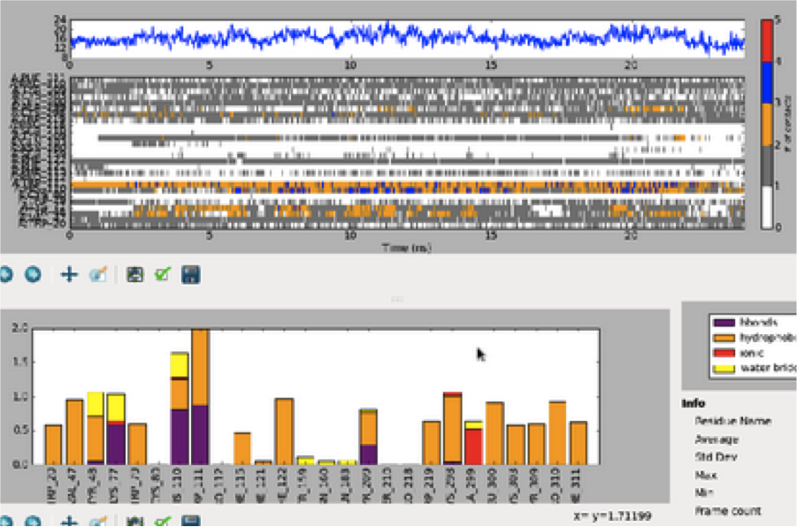
Here’s an example of an interface I was recently asked to review.   If you’re particularly passionate about UX you’ll notice all sorts of things that could use help here – and you’re right.  Perhaps one day I’ll devote an entire blog post to just this interface.  But for now, focus your attention on the division between the top graph and the bottom graph, as we’re going to be talking about how the user is repeatedly forced to shift attention between the two.

mentalram1

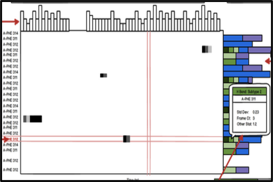
The UI actually accomplishes a very simple task.  What you’re seeing are the results of a simulation between a molecule and a protein over some period of time.  The different ‘segments’ of the protein are listed on the vertical axis, the time is listed on the horizontal axis, and the little colored dots in the middle represent the number of interactions between the molecule and a certain segment of the protein at a certain point in time.  The horizontal line graph at the very top represents the vertical summation – that is, the number of interactions across ALL SEGMENTS of the protein at a certain point in time.   How about the bottom bar graph?  Well, that represents the horizontal summation – so the number of interactions across ALL TIME for a specific protein segment. So what’s wrong with this interface?  The problem is that users often compare values from the top graphs with those in the bottom graph.  And every time they do that, they have to load into working memory some information (the name of some segment they care about, perhaps the color coded value) and then, while repeating that information to themselves over and over (just like a phone number), search through the bottom graph to find the corresponding segment (each horizontal label here corresponds to a vertical label in the top graph).  Then compare values.  Then go back to the top.  Then rinse and repeat.   And this is something that happens often enough that it gets in the way of the actual task. You can probably see where I’m going with this.  Here’s a revamped UI:

mentalram2

Here we’ve moved and rotated the bottom bar graph to the right side of the top graph.  We’ve made all sorts of other little changes, including floating red ‘tracking lines’ to help you keep track of each row and column and bar styling at the top for consistency’s sake, but the two important things here are that

  1. The user gets a quicker idea of how these graphs all relate from the getgo
  2. (More importantly) The user doesn’t have to switch attention from top to bottom, from holding values in memory to matching segment labels in two different graphs.  They can simply move their eye from a segment label to the far right of the graph, the same way that they moved their eye from a time label to the far top of the graph.  This lets him stay focused on comparing values, finding patterns, and  developing insights.

You’ll always want to ease the most repetitive and common tasks as those are the most likely to create bottlenecks in the larger workflow.  Note that this is contingent on knowing your user and his problems intimately.  Without clearly defining your problem, you can’t validate your solution.

Manage attention through visual groupings

So it’s all fine and good to help the user stay on task and focus on one part of the interface, but how does the user actually parse an interface – especially the first time it’s presented to them?  Ultimately when you look at a screen, or a poster, or even just a room, the early stages of visual processing in your brain sense only a great deal of disjoint lines, colors, perhaps shapes, and so on.  Enough, in fact, that it can be relatively difficult to keep track of all of them – to pay attention to or grok what’s in front of you.  While 70 lines of text and 20 buttons can overwhelm your working memory system, five to nine groups that neatly relate these elements to each other and help abstract the interface are much more manageable. You can help the user make sense of a complicated interface with many things going on by taking advantage of the fact that the visual system classifies things based on similar features.   Take a look at some of these familiar interfaces and how they use some common Gestalt laws of grouping.

chunking1chunking2chukning3

  • Relative distance:  Notice in the Google News interface on the far left that the distance between article titles and sources (USA TODAY) is much smaller than the one between articles, which is much smaller than the one between sections.
  • Color:  Without even reading labels or captions, you know that the blue things in the Google News interface are similar to each other and different than the non-blue weather pictograms below.
  • Shape & Size:  How about the Google Chrome interface in the middle?  There are a lot of buttons at the top.  Still, they’re relatively manageable.  Three of them are colored – they must form a group.  There are a bunch of flat-pyramid-looking-things on the right of that which can all be grouped together as well, and then there’s a big white rectangle below which is clearly separate from everything else.
  • Common backdrop:  The top of the Yelp interface includes all sorts of text, an input box, and more, but users don’t have to read every little link before realizing that  they all have something in common – they’re navigation elements.  This way, the user can mentally skip this and move on to the next area with a common backdrop, which happens to be the content of the page.

These are obvious.  It’s hard to think of anyone not taking advantage of rules like this, but you see it all the time.  Often the mistake is not in failing to communicate relationships by using these principles, but in unintentionally succeeding in communicating misleading unintended messages.  One semi-recent addition to the New York City subway is a system of electronic signs that list how soon the next train is coming.  When the projected time is under a minute or two, the text turns red.  Unfortunately, red is also the color associated with the 1,2,3 trains.   This makes for frequent slips of judgement, especially when users are daydreaming and otherwise not devoting their full attention to the sign.


Curate attention by using size and color to communicate importance

Even if you’ve helped the user understand and manage what you’re showing them by grouping things into fewer concepts, there’s still the question of what they ought to look at first.  And that’s an important question, because oftentimes it determines whether they’re going to stick around and how they’re going to conceptualize and remember the experience on every subsequent visit.

This is where size and color can really make a difference.  Certainly any of the rules discussed above can also work – the point is to selectively apply unique characteristics.  Take a look at some examples

vizhierarchy1


ITunes provides a big “Music” label and two prominent buttons in the middle of the screen.


vizhierarchy2

The Twitter interface greets you with a giant blue button – unlike any other button on the page.  When you notice its color, your eye also notices the few other blue things on the page (top right and top left) which happen to also provide important high-priority functionality.

vizhierarchy3


 My favorite example.  Google’s Gmail web email client offers a great deal of functionality.  The most important, though, Send and Search are colored blue and red to catch your eye from the moment you first see the page.

Interfaces & The Mind: An Introduction

I was at a get-together recently when someone dropped the question: “so what do you do?”   I paused for a bit before revealing that I design software – half to gather my thoughts and half to take one last sip of my drink before the unavoidable follow-up questions.  Software design?  Do you make icons and stuff?  Do you have to be really good at computers?

I spent a few minutes talking about how I work with people to identify problems, come up with features, apply psychological principles to make intuitive interfaces, and so on.   It’s very well rehearsed by now and always tends to leave people with a very intrigued look on their face.   A few minutes later, my new friend insisted on introducing me to a few friends.  We walked over, shook some hands.  She then went on to introduce me as her “new programmer friend.”  So much for that.

Software design is a misunderstood field. And rightfully so.  It’s relatively new, it’s a niche inside a niche, and it’s highly multidisciplinary.  You can’t really go to school to major in software design.  The software designer is sorely missing from the typical lineup of firemen, scientists, and doctors in children’s literature, so  it’s no surprise that people simply remember ‘programmer’ – they have no prior schema to relate it to.

This multi-part series of posts intends to introduce software design from a slightly more approachable angle – that of psychology.  In the posts to come, I’ll be talking about how things like working memory, visual attention, and other brain processes affect the way we make sense of and interact with software interfaces.


From Stovetops to Tablets

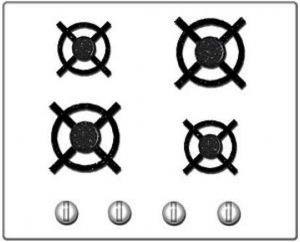
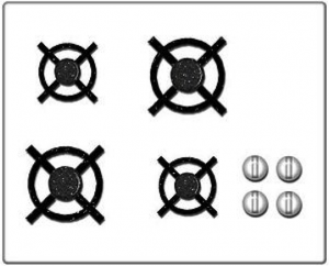
Let’s start with something that has nothing to do with software. Look at these two stove top designs.

stove1stove2


Which one would you prefer to own?  Price and other factors aside, the one on the right is clearly easier to use due to what’s called a ‘natural mapping’.  There is a clear analogy between the square configuration of knobs and the square configuration of burners, so turning on a specific burner is much easier.   Now take a look at the computer interfaces below.

programInterface1  programInterface2programInterface3


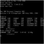
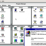
These should be somewhat familiar.  They represent the progression of user interface technologies over the last thirty or so years.  And there’s an analogy here:  just like each of the two stove interfaces above allowed a user to identify a burner and activate it, each of these interfaces allows someone to identify a program and start it up.  Certainly there have been some major leaps forward in stovetop and computer design.  Each one is a little easier to use than the last.  The interesting thing is that the key to improvement in both cases was lessening the gulf of representations.  You could say that the ‘better’ interfaces – whether stove or screen – required people to jump through fewer associative hoops.   To do less translating from one mental concept to another.   All of which ultimately lessens the burden on working memory.

The first, more awkward, stovetop interface has you jump through (at least) two associative hoops.  First of all, you have associate a plastic knob with a burner and the act of turning it with the concept of starting a fire.  It’s obvious today, but if you were to bring along a time traveler from the 18th century and stand him in front of the stove, their first instinct would likely involve touching the burners themselves.  Second, and more relevant, you have to associate a line of knobs with a square of burners.  Likewise, with the first command line interfaces, turning on a program involved a few steps of implicit mental acrobatics.  First you had to identify a program – for which you had to decode a line of text (often cut off, often involving a cryptic suffix like ‘exe’ or ‘bat’).  Once you had identified the program, you had to translate the action of ‘opening’ into a phrase involving words like ‘cd’ (which you mostly had to memorize).  Finally, once you had the proper phrase in mind, you had to translate that sequence of letters into keystrokes on a keyboard that (somewhat arbitrarily) threw the alphabet into a relatively unintuitive configuration.   The Windows 3.1 interface eliminated a few of these problems by allowing you to see pictures, which the visual system has an easier time parsing quickly, and by allowing you to do something akin to ‘pointing’ with your hand – something almost innately familiar.  I’m talking about the mouse, of course.  If you’ve ever watched an elderly person use a mouse, you’ve seen that it’s really not that easy.  Sure, the directional mapping is somewhat natural – up is up, down is down, and so on, but you still have to develop a sixth sense for how the speed of the mouse relates to the speed of the cursor.  It’s almost like learning to work with your fingers under a microscope.  Finally, touch interfaces came along and eliminated that associative gap too.    In the picture on the right of the Windows 8 interface, you identify an object using a large, prominent visual representation and then manipulate it by reaching over and touching.  Just like in real life.

The point here is that the same mental processes and constraints that apply to our understanding and manipulation of every day objects like stoves (or doors, or signs, or even people) apply to computer interfaces as well.  Computers are just the next generation of tools and environments that we, as humans, have begun to interact with.   One of the principal challenges of a software designer is to design tools in a way that takes into account human psychology – whether it’s hard-wired  such as motion detection in peripheral vision or commonly learned associations like the tendency to read from left to right or to assume that a mouse cursor in the shape of a hand implies interactivity.

In the same way that an architect elicits emotions like pride through certain materials and large spaces, or that a film director draws attention to an important detail by briefly cutting to the knife behind the murderer’s back, a software designer in many ways curates human attention as we  experience and explore virtual environments.

This is by all accounts only one part of software design.  I’ve left out any mention of the user research process, teasing apart implementation ideas from fundamental needs, understanding context, validation, aesthetics, and a host of other important things – but this, to me, is the fundamental and unique thing that design brings to software.  This is the angle that makes software design approachable and relatable to people outside (and even inside) the world of technology – distinguishing it from pretty pictures, from programming, and from business concerns.

In the next part of this series, I’ll delve into working memory and some of the ways that it can be applied to software design.

How Spotify can take over the world

This title might be misleading since Spotify has already taken over the [music] world.   Somehow over the last few years it’s managed to get access to almost all published music and make it available for free to everyone.  It’s woven itself into Facebook, introduced social music sharing, buried Grooveshark, all but replaced Last.fm for some people, and is slowly replacing the default ITunes app for many others.  Given its giant catalog of music, its access to user data and mobile devices, and the advances in sound processing that are slowly making their way into the mainstream, here are a few directions that I hope Spotify explores in the years to come.

Spotify is well equipped to become a predictor and analysis engine for the music industry

The improvement of musical analysis technologies (ex: Melodyne DNA), combined with information about listening habits, social spread and stickiness, combined with a library of all of the world’s music is a great recipe for big data.  There are so many patterns to extract.

Imagine Spotify doing a daily number crunch that results in purchasable recommendations for record labels, radio stations, and tv commercials.  Or it can become an analytics platform – ala Spotfire for music – one that allows content producers and marketers to filter trends by demographics.  Every bit of information can come in handy to some niche audience – for example, listening trends filtered to a  location can turn into helpful information for concert promoters.

Better use of Facebook and other information can result in improved personal listening recommendations 

What you may enjoy depends on a host of factors outside of what you’ve listened to and ‘liked’ previously.  Things like time of day and energy level can affect what you listen to.  Spotify has access to Facebook data, much of which hints at your other interests, your mood, and so on.  People are more likely to enjoy and remember something if it’s emotionally relevant at the moment.  If a user allows it, there is probably some value in parsing out sad words versus happy words and other things from status updates.  Or at least recommending things based on age and other shared content and Facebook ‘likes’.  I guarantee that the average reader of the Onion is more interested in Radiohead than the average FarmVille player.

The web is getting smarter, though.  The recommendations Spotify makes don’t have to be based on simple text searches in status updates but could dig into more complex relationships.  Sharing and gifts are one.  Say Spotify notices that your friend Mary gave her friend Susan a song and Susan ‘starred’ it or later shared it.  If Spotify later notices that your tastes are similar to Mary’s, it should recommend you send a song to your friend Jacob who has similar tastes to Susan.  Point is, patterns occur over time, involve multiple steps, and take into account all sorts of surprising information.

Better discovery through the use of physical location

A few years ago Microsoft’s Zune music player introduced ‘scribbling’ or ‘squirting’ or some other unfortunately named feature that involved sharing music with people in your geographical vicinity.  The device failed for a number of reasons, but I think it was on to something.   You’re often in physical locations with people that you share unique and subtle commonalities with – things that Facebook can’t capture.  Whether it be a coffeeshop barista playing song after great song, or every member of the audience at your favorite band’s concert or, heck, even a political rally, the value of peeking at your physical neighbor’s music collection can be much greater than seeing a feed of what your random Facebook friends and acquaintances are listening to.  Here are just a few interesting things you could do with that.

  • Suggest friends –  imagine you’re at a party and the Spotify mobile app notifies you that your taste lines up very well with someone nearby.  When has music not been a good conversation starter?
  • Taste sampling – absorb an anonymous sampling of music from everyone around you – a one button action that creates a playlist.
  • Satisfy your audience:  let’s flip around the example from earlier and look at it from the barista’s angle.  If the barista’s phone (or a DJ’s for that matter) had some knowledge of the musical preferences of the people in the room, she could play much better music for everyone around her.

Spotify as some sort of heaven for DJs and mashup artists

I was once in a room where the DJ put on the Godfather soundtrack and expressed how much he wished he had Dark Side of the Moon handy on vinyl.  Not only does Spotify solve the problem of providing you with songs by name in the blink of an eye but, soon enough, (if it doesn’t already) it will also have information about chord progressions, tempo, time signatures, and other musical characteristics for every single song.

There are relatively straight forward rules for what works well with what in music.  A given tempo will work well with multiples of that tempo.  A song will work well with an accompaniment in the same key or in the relative minor key.  Even for more complex things like chord progressions there are rules of thumb that trained musicians use on a daily basis.  Imagine a DJ picking a base track, a few mixing parameters, and choosing from a few instantly generated Spotify recommendation for layers that would go well on top of it.   Down the line, thanks to the growing interest in sound hacking the DJ will also readily change a loop from minor to major, making it a little more ‘waltzy’, and otherwise fine-tuning things to his taste.

Spotify could ride on top of this as a publishing platform.  Think about how much content online is part of the media ‘long tail’ .  Whether it’s Star Trek Picard photo memes on Reddit or GI Joe video overdubs on Youtube, the newfound availability of …all…visual content has led to a huge increase in amateur content – some of it very good even.  And if it’s not great, it still provides free publicity for the original content that spawned it.  Spotify has the opportunity to do the same thing with music and actually benefit from it.  Build an IPad interface to easily layer songs, speed them up, slow them down, add reverb and echo effects, and you have a pretty cool tool that at least a few teenagers would play with.  Offer a ‘save button’ that exports exclusively to Spotify (perhaps in the ‘mashups’ section of every artist whose work is involved) and you have yourself a new source of content, marketing, and user loyalty.

Spotify as a serious tool for musicians and composers

Along the same notes (pun intended), Spotify’s access to an insane amount of music and music data could change the way we create songs.  Not only could it help you choose between two different version of your new song’s chorus based on observed listening patterns, but real data could be used to augment the processes of inspiration-seeking, jamming, and performing.

Exhibit A in Future-Mozart’s musical toolkit:  Spotify recommends layers, modifications, and stylistic directions based on songs that contain similar ‘base’ content.   You’re working on a song where the vocals are hopping over the percussion – maybe some sort of syncopation or polyrhythm.  Spotify classifies this as a pattern in musical state space (the same way Pandora extracts features from music to recommend similar songs), notices that Fiona Apples does the same thing in one of her songs, and recommends a subdued approach for the backup instruments based on Fiona’s matching song.  If it worked for her, it may work for you.

But don’t think of this as taking place in the Spotify app necessarily.  It can be part of music software like Logic and Pro Tools, or even built into instruments.  Imagine a guitar amp that listens to the simple solo you’re playing and, after a few repetitions, starts playing a great chord progression from Weezer on top of it after doing a search through similar musical space.


These are just a few ideas.  The things you can do with access to a giant catalog of music, analytical tools, and social information are limitless.  It’s really pretty exciting and I, for one, welcome our future musical overlords.

Paris Metro Catch22

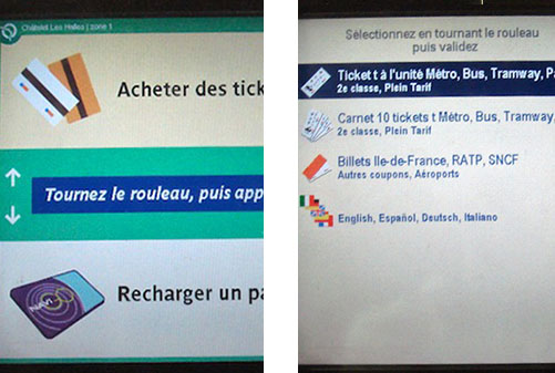
paristickets

Paris gets a lot of tourists every year so you’d think their automated metro ticket machines would be slightly friendlier to folks who don’t speak French.  When you first walk up to the machine, you’re met with a French welcome screen (left).  No language-picker button UNTIL you choose a menu option in French and arrive on the second screen. Who designed this?  To be fair, this system was likely dead in the water in terms of design environment:

  • My guess is that the two screens were designed by separate teams with no one to sanity-check or unify the experience as a whole.
  • This a great example of ‘you are not the user’.  The designers in charge simply don’t know what it’s like to not understand the language.  On second thought, there probably were no designers on staff.
  • There is no chance for real user feedback.  When tourists are confused, they either 1.  ask a local who has no one to complain to, or   2.  ask a metro operator that feels no responsibility for the system as a whole and is part of a large bureaucracy that doesn’t encourage bottom-up communication.

C’est la vie.

An unfortunate doorbell in Williamsburg

Unfortunate doorbell

I ran into this doorbell while looking for apartments in Brooklyn.

What’s wrong with it?  Just ask yourself what you would do if someone told you to ‘ring the third floor’.   Third floor is almost always above first, so the numbers must not represent floors, but apartment numbers…right?  Or maybe they do represent floors but there were some wiring difficulties so it had to be arranged upside down.   Testing and experimenting is also risky because you might disturb the wrong person.